Feeds:
Posts
Comments

Posts Tagged ‘fired earth’

Colour is a great asset to use in any home, whether you’re pulling in bold accents into a room, pairing two colours to make an unusual combination, or even going for a daring monochromatic look. A monochromatic scheme can create a strong, bold look in a room, really giving it some presence. Here’s a few beautiful monochrome rooms to give you some inspiration.

Blue Monochromatic Room from Domino via Pinterest

This dark blue room is a feast for the eyes; everything is soft, deep and dramatic whilst the blue makes it feel sophisticated and contemporary. The key with monochromatic rooms is to make sure you have enough texture in the space to give it depth, like the velvet sofa and of hint of purple from the plant. For a beautiful navy paint colour, Fired Earth’s Carbon Blue is a lovely true blue and would have a dramatic impact on the walls. For a sumptuous navy velvet, take a peek at Osborne & Little’s Mikado Velvet collection, they have a whole range of shades but a perfect one for this look is number 6990-08.

Pink is a great colour to use in a monochromatic look and creating the perfect sophisticated setting is all about finding the right shades of pink. Heavily playing on light and dark tones will help add a contemporary element to the space, too much of one pink and it might become a little marshmallow-y. Below they’ve used a dusky pink for the wall and a maroon-pink for the ceiling and for the furniture which really holds the space together.

Pink Monochromatic Room from Domino via Pinterst

There is a huge range of pink or pink-toned paints around at the moment, just make sure you stick to the same type of pink, for example finding a dark and light blush pink. A beautiful pink is Tuscan Pink from Zoffany, with lovely earthy tones to it. To add a spark of interest to the pink scheme, this Atlas fabric from Zimmer + Rohde has beautiful pink tones as well as an abstract landscape-style pattern that would make a stunning pair of curtains in an all pink look.

Atlas Fabric from Zimmer + Rohde

This beautiful green room creates its depth with the use of white to add structure to the space; the sharp white picture frames pop against the green wall, and the off-white rug has different green embroidery to give floor a strong sense of personality. Green makes a great monochromatic room colour choice as it can be naturally given texture and depth with the use of plants, like below different cacti have been added for points of interest and richer impact.

Green Monochromatic Room from Domino via Pinterest

I love De le Cuona and all their pieces, but they have some beautiful fabrics that would really work with a mossy green monochromatic room, take a look at Mistral in Drizzle and Primitive Linen in Fennel. For a similar green grey paint colour, Farrow & Ball’s Blue Gray and Cromarty would complete the look.

Grey seems to be a never-ending popular colour, so if you love it take it one step further by using deep dark hues in a room, from the paint to the furniture and adding in interesting juxtapositions of light hues against the dark.

Dark Grey Monochromatic Room from Apartment Therapy via Pinterest

When using such a dark colour for a monochromatic space, make sure to select materials that’ll allow light to bounce of them, therefore avoiding a black hole effect. This Cascade wallpaper from Zoffany has an amazing ribbon effect, which will not only add a strong design element but pick up the light as well.

Cascade Wallpaper from Zoffany

For a really luxurious looking monochrome room, you can’t go wrong with an all Teal room. The peacock colour makes a strong statement, and if you love glamorous interiors, it’s perfect for you. Below they used gold accessories to draw out the richness of the teal; with such a strong colour like teal, just using at as feature wall in an attempt to ‘tone it down’ can sometimes have the reserve effect, and actually making the bold move and painting the entire space in the colour will create a simpler, sophisticated look. For a triumphant teal, Farrow & Ball’s Vardo has the impact you’re looking for, and for a beautiful fabric to go alongside, the teal version of Anthology’s Vivid fabric will make the perfect pair.

Teal Monochromatic Room from Apartment Therapy

A monochromatic room can be an amazing, stylish and unexpected way to decorate a room; so you want to create an impactful space, have a think about trying out a monochromatic room using your favourite shade.


Read Full Post »

The interior world has been dominated by neutrals for a long time, but now we are beginning to see colour come back into our homes, on the walls, floors, furniture and accessories. People are becoming a little gutsier with their choices, and we are singing their praises. While there is nothing wrong if you like a simple palette for your home, but by adding in accents of colour it’s a way to add life into the scheme as well; and we’re not just talking about electric, bright colours necessarily, but the involvement of deeper, darker tones that can complement a neutral backdrop while giving your home warmth and a welcoming sense. That being said, with our fear of colour slowly lifting, and the experimental phase creeping through, there are some fantastic colour combinations out there that’ll add a sense of individuality and just the right amount of quirkiness to your home, and give it an exciting atmospheric feel; I’ve picked five of my favourite colour combinations to show you that keeping your home classic and stylish doesn’t mean shying away from bright and beautiful.

Orange and Blue Combination, Image from Cote de Texas via Pinterest

An absolute favourite combination of mine if orange and blue, but it’s all about finding the right shade of each. The perfect blue in my eyes to combine with an orange is a dusky one with a hint of green grey in it; the best accompanying orange, a pastel-toned, soft orange. Imagine a crumpled, vintage orange velvet that’s become a little faded from the sun and has a few dust marks on it, that’s the perfect orange. The key to combining colours in your interior is to be open to the wide spectrum of tones, hues and shades; blunt orange and a primary blue will look harsh together, constantly fighting for attention and eventually giving you a headache, but the soft tones of the two shades in the photo above, show that the right shade can create a serene and relaxing space. For a beautiful shade of blue, try Farrow & Ball’s Light Blue and for that dusty orange, Edward Bulmer Natural Paint’s Brick is a great choice.

Dark Green and gold is a rich combination, it’s has an historical, timeless yet completely current sense to it. The strong stature of a dark green wall placed together with an iridescent gold counter, table or lighting fixture gives an interior a grand sense of glamour. The natural forest foliage and natures prize procession blend together to create the most sophisticated of combinations; both in traditional and contemporary settings. A dark green kitchen with aged gold hardware, taps and accessories, is a look that’ll forever be timeless. The kitchen below uses contemporary details to keep the space feeling current, while the dark tones are contrasted against the pale wood floor, showing off the depth and tones of the colours. For a beautifully dark green, you’re spoilt for choice, try Farrow & Ball’s Studio Green, Fired Earth’s Malachite or Sanderson’s Amsterdam Green.

Green and Gold Combination, Image from Apartment Therapy via Pinterest

Pink has been a big interior trend for a few years now, and I can’t help but to have been suckered in by it; it’s turned the idea of pink from being innately girly and babyish, to a shade that is quite sophisticated, current and cool. From deep pinks to blush to pastel, there are plenty of ways to involve the colour into your interior, and a winning combination for me is to pair it with blue. Pink and blue will look fantastic together in a whole range of depths and shades, but the key fact to remember is to match the weight of both colours; a deep blue with a deep pink, or a pastel blue and pink, so that one doesn’t get lost against the other and appear a little wishy-washy. The image below beautifully shows off how colour blocking the two shades in the same space gives a modern and playful feeling. Take a look at Paint & Paper Library’s Temple and Blue Pearl for a beautiful pink and blue look.

Pink and Blue Combination, Image from House & Garden via Pinterest

A thick, deep grey mixed with a golden, rich yellow is an interesting way to create a contemporary, alternative-glamour styled room. By avoiding the lighter, pastel yellows and heading for the deep and dark there is a vibrancy that becomes even more apparent when paired with a deep grey. The combination offers a modern approach to using yellow; a bold, strong look as opposed to a nervous neutral tone veers far from the magnolia and straight into the eye-catching and characterful. Below, the grey surroundings could have been easily paired with a classic blue or green, but yellow gives the bathroom a fun and playful presence that are still balanced out by the sombre nature of the grey and the traditional features in the room.  For a spicy yellow, take a look at Farrow & Ball’s or Babouche, paired with Purbeck Stone or Worsted.

Yellow and Grey Combination, Image from Miles to go Before I Fall Asleep via Pinterest

My final colour combination is one that I think has received a bad rep over the years, purple and green. For a long time all I could picture when it came to this mixture was the garishness of royal purple and lime green; a noughties interior design ghost that was desperately in need of an exorcism. However, just like with very brave colour combination, it’s all about finding the right shade. For the green think forest or olive, and for the purple head in the direction of deep violet or lavender, more natural hues of both colours help to create softer, more romantic interiors. In the image below, the colours are soften by the use of velvet, adding texture to the palette. For a dusty lavender, Fired Earth’s Cleopatra’s Nose has an atmospheric hue. For the green’s think about Card Room Green, or Calke Green from Farrow & Ball.

Purple and Green Combination, Image from Hum Ideas via Pinterest

Learning not to be afraid of colour is the first step to creating beautiful and interesting interiors; the second step is finding out what works for you and your home. Once you’ve found your perfect combinations your interiors will be filled with life, colour and happiness.

Read Full Post »

They often tend to be forgotten about, but stairwells are a prime bit of decorating real estate. As long as the basic function of your stairs isn’t compromised, you can have pretty much a free reign on how you’d like to utilise the area; turning it from a passing space getting you from A to B, into a beautiful feature in its own right. Whether you’re thinking big and bold or simple and sweet, there are loads of great ways to style a staircase, and the individual parts of them that you may not have thought about.

Your stair risers, the vertical part between each step, is often an underrated part of your stairway, and it’s a great place to add a little stylistic element, especially if you have narrower stairs that can’t afford to give up any surface space. Depending on your style, and the style of your home, there are all sorts of ways to get creative. Using tiles to decorate your risers can be a lovely way to introduce a pattern or colour into the area, and can really give your stairs some extra flair. This monochrome mix of tiles leading up the stairs really adds some personality, turning the stairs into a main focal point.

Hand Painted Tiles on Stair Risers from Eva Rees Flickr via Pinterest

I love this idea of introducing to developing a theme with the tiles you’re using, these Gatsby tiles from Fired Earth has an Art Deco style, and could give a staircase a really beautiful, smart finish.

Gatsby Tile from The High Society Collection from Fired Earth

If you live in a rented property, or just what to try out a style, using decals is a simple and easy way to add a pattern to your stairs. This geometric pattern has introduced a bit of flavour to a clean and contemporary case of stairs; it works perfectly with the dark wood of the steps.

Stair Decals by Stickers Colouray at Etsy

The wall leading up the staircase is an optimal location to hang a collection of artwork, big or small, especially if you have a few pieces that don’t quite go with the style of your living or bedroom, but you love them anyway. A stairway is well suited for this as it means you’ll see your pieces everyday but not all day, every day. You might want to create some synergy between your artwork, sticking to similar style frames and the artwork itself, or use the space as a miscellaneous heaven, with a collection you’ve been compiling for years and can continue to add to.  I like the black and gold theme of this collection below, it gives a sense of matching tranquility, as well a glamorous feel.

Collection of Prints with Gold and Black Frames from Apartment Therapy via Pinterest

If you have a collection similar to this one, creating a beautiful wall display on your stairs may be the best way to show it off. Displaying it on the stairs means both you and your guests will find new discoveries as you’re coming and going.

Collection of Curiosities from Remodelista via Pinterest

In the same way a collection of art works wonderfully on your stairs, so does a gang of mirrors, or ornamental frames. Whether it’s a contemporary, vintage or traditional style you want to go for, a selection of mirrors moving up the stairs can make a beautiful feature. I love this collection, they’re all different, but kept in sync by their white frames.

Antique Mirrors on the Stairs by Turquoise, Tulips and Bliss via Pinterest

Somewhere in between artwork and antique mirrors lies these gorgeous glass frames from Anthropologie. With their ornate detailing, tassels and space to put prints, postcards, leaves and memorabilia, they’d make a beautiful feature on your stairs.

Royal Theatre Frames from Anthropologie

If you have a wider case of stairs, or perhaps a landing between two flights, you have the opportunity to use of a bit of surface space to decorate. A simple way to give this area a bit of life is with some pretty lanterns, which are always sweet and can be found in a whole variety of styles. If you’re worried about a fire hazard, you can always get some good quality LED candles that’ll still keep the ambience going, without you having to check on them every few minutes. I love these lanterns below, they’re a soft brass colour, which really pops against the stark white or the rest of the interior.

Staircase Lantern Decoration from Anne Sage via Pinterest

For a similar look, these brass lanterns from Mia Fleur will do the trick nicely, the different sizes with help create a nice flow as you move up and down the stairs.

Brass Lanterns from Mia Fleur

For a contemporary take on the Moroccan style lantern, coming soon to Maison du Monde are these fabulous Breme lanterns. The curved glass panes are a nice design feature, and would look beautiful contrasting a white wall, or embracing the drama in a darker interior.

Breme Metal Lantern from Maison du Monde

Your staircase can be more than something you just run up and down when you’re in a rush in the morning; instead it can be a glorious array of style and intrigue, full of creative ideas and interesting items that you pick up over time, giving you an excited new space in your home.

Read Full Post »

As with all colours, there are hundreds of shades in the yellow family, and sometimes the thought of using the bolder, brighter shades can be intimidating due to their strong look. But if you’re looking for an alternative to the neutral, or darker palettes that are around these days, yellow may be the perfect colour for you, especially if you want to show off a strong, confident style in your interiors. Though the colour has always been popular in the design world, in recent years yellow interiors, furniture and accessories have been making quite an impact, especially in those brighter shades. There are lots of exciting ways to incorporate yellow into your home, that can really showcase a particular style; whether it’s contemporary, glamorous, bohemian, traditional, or a combination. Adding a dash of yellow could be the way to bring a refreshing, exciting look to your home.

Using a bright yellow on the walls of your home may be a touch overwhelming if you’re a yellow novice, but if you’re already a fan, it’s a fantastic way to create a statement. The trick is finding your perfect shade to suit your home, and choosing the right complementary accents to create a well-rounded, flawless look. To keep your wall looking fresh opt for a rich shade that won’t shy away into the background. For a contemporary look, I love the dramatic but playful nature of Farrow & Ball’s Babouche shade.

‘Babouche’ from Farrow & Ball

And if you’re in need of a more traditional shade, the Sudbury Yellow has an elegant and regal nature that will give a room a strong sense of character, without overshadowing any other wonderful features you may want to put in there.

‘Sudbury Yellow’ from Farrow & Ball

Another way to add yellow into the core foundations of the home’s design scheme is with some creative tiling. Fired Earth always have a strong collection of interesting colours and patterns, and some of their yellow tiles are to die for. For a bold, exciting look, these vibrant mustard coloured tiles are the perfect background against a crisp, white bathroom set. There’s a combination of luxuriousness and quirkiness about the colour that creates an overall refreshing look.

‘Carnival Oro’ from Fired Earth

If a solid block colour is a little too much for your taste, or your home, going for something a little sweeter and more minimal might do the trick. This Atlas design by Neisha Crosland for Fired Earth has a rustic, farmhouse vibe, but with a little exotic twist to keep things interesting. It’s an ideal design if you want to have a traditional looking kitchen, but with a touch artistic individuality to it.

‘Atlas by Neisha Crosland’ from Fired Earth

To make an interesting statement in your home, you don’t just have to save yellow for the larger features, in fact adding small accents of the colour to a room can give it some vitality, or reinvent an interior without changing too much. Contemporary interiors are often neutral walls with the inclusion of furniture pieces in modern wood types, and adding a dash of yellow into the mix can create an up-to-date look without taking away the original essence of the room. Margaret Howell created some fantastic designs for Anglepoise, and though I’d happily have any of the three colours in my home, the Yellow Ochre edition is stunning.

‘Type 75 Desk Lamp by Margret Howell in Yellow Ochre’ from Anglepoise

This chair with a yellow seat from Gubi is rather special, it’s an ultra-contemporary design that’ll look gracious and cool in a modern home. The design also comes with a white seat, so you could mix-match the two colours around the dining table, or save the yellow for the head of the table to give the whole look a pop of colour.

‘Mategot Nagasaki Chair’ from Gubi

A striking yellow rug can really transform a room in one fell swoop, to keep things feeling light and not making the room look too dense, a patterned rug is a great way to add some yellow without swamping the room. The Sellarsbrook design created by Suzanna Sharp for The Rug Company, has a sophisticated geometric pattern that adds a timeless depth to the rug.

‘Sellarsbrook in Yellow by Suzanne Sharp’ from The Rug Company

This rich, crisp yellow velvet sofa really packs a punch, that’ll give your living room some vivacious character. The chesterfield design is given an alternative look, creating a piece that can be mixed into both contemporary and traditional interiors.

‘Balmoral 2 Seater Sofa in Varese Velvet Alchemilla fabric’ from Heal’s

For a sweet touch to a traditional bedroom, these rustic, French style bedside tables in a dusty yellow could be a great way to frame a bed in a similar style. The piece from Out There Interiors has some fetching ironwork detailing, which will give a room some extra style in a simple way.

‘Two Drawer Beside in Yellow’ from Out There Interiors

These lemony plates and dishes from Habitat are a refreshing way to give your dining table an updated look, the ombre effect means that they aren’t too outlandish, and will gently show off the zesty colour. Place them on a blue tablecloth or next to some coloured glassware for a really stylish look.

‘Atkinson 12 Piece Yellow Dinnerware Set’ from Habitat

Lastly, this gorgeous glass pendant from Rockett St George is an absolute beauty! The moody yellow shade combined with the irregular shape gives the whole look an understated, glamourous feel. This pendant would be the perfect addition to a dark, moody room, giving it that hint of colour it needs to keep it from looking drab and dingy.

‘Hand Blown Glass Pendant Lighting in Yellow Ochre by Curiousa & Curiousa’ from Rockett St George

Though it can be quite a daring and brave decision to add a bold shade of yellow into your interior (and may take a little more persuading for some), it’s a decision that will result in some fabulous and sophisticated homes! Whether you’re already in love with colour, or prefer your interiors more neutral, you’ll see how diverse a colour like yellow can be and how easily it will suit all kinds of styles.

Read Full Post »

When it comes to redecorating a home perhaps the most important decision you’ll make is what colour your walls should be, make the wrong choice and you’re stuck with a peculiar colour until you can summon the strength to do it all over again, but make the right choice and your home will transform before your eyes.

The paint company most of us jump straight to for beautiful colours is the paint master themselves Farrow and Ball, and it’s true they do produce fantastic, timeless colours, but with so many other fabulous companies producing amazing paints I thought I’d put Farrow and Ball on the backburner for today and introduce to you some of the best paint companies around.

Designers Guild are known for their bold patterns and their colour palette in their paint department is no different, from beautiful pastel pinks, to zingy lime greens if you’re walls are in need of the ultimate sprucing up then Designers Guild should be your first port of call.

First Blush by Designer’s Guild

Mimosa Leaf by Designers Guild

I absolutely love this Mimosa Leaf colour, it’s a bold move that certainly isn’t for the faint-hearted but if you’ve got the guts it’s definitely a way to make an impression. If you want to introduce a wild colour into your interiors it’s best to opt for a room that has either a lot of windows or features that will break up a wall so that you can avoid one giant block of colour that might end up looking a little scary and intimidating.

If bright, colourful hues aren’t really your taste there are some absolutely drool-worthy tall, dark and handsome colours around if you’re looking to add a little mystery and romance to your interiors. The Little Greene Paint Company is a lovely company that create a super high quality paint collection and they have some outrageously glamourous dark shades in their range.

Obsidian Green by The Little Greene Paint Company

This bluey green reminds me of the depths of the ocean and creates an amazing modern presence in a room especially when mixed with the richness of a dark wood like in the photo above.

Invisible Green by The Little Greene Paint Company

The smokiness of this green creates a beautiful earthy, organic ambience and with the splash of hot pink, or another bright colour, there is a real contemporary vibe to the atmosphere. When using such a dark colour it’s always important to have a lot of natural light so that the colour doesn’t overpower the room but instead will be showed-off in the light.

One company that has really found its stride in its paint department is Fired Earth, they are producing some wonderful colours. Their most recent spring collection was created around the theme of birds, my personal favourite was the Peafowl green, a wonderful colour that is bold enough to make a statement but not so bright as to make a room too intense.

Peafowl by Fired Earth

Just like some people, some homes have a natural flair for the dramatics and finding the right theatrical colour is crucial. There’s a devilishly exciting feeling about using black or near-black in a home, it’s a little off-key and against the grain but if done well and in the right home it can look absolutely terrific. Charcoal from Fired Earth is oh so tempting and is an extremely brave and original way to reinvent an interior.

Charcoal by Fired Earth

For something just as rich but a little mellower, a deep plum purple is a great way to add drama to a home but still maintain a scheme that works in the everyday.

Carragheen by Fired Earth

For a diverse range of tones and hues Sanderson and Zoffany have wonderful collections ranging from pale pastels to moody blues. Companies that make the paint, fabric and wallpaper trio have a natural knack at creating the perfect symmetry between each material. So if you have a sofa upholstered in a fabric by a beloved designer or a feature wall in a wallpaper, looking into the same companies paint range may be the best way to find the most complementary schemes.

Ming Gold by Sanderson

Tuscan Pink by Zoffany

Prussian by Zoffany

There is so much fun to be had when choosing paint colours for your home, it’s the perfect opportunity to explore and experiment with your taste and your comfort zone and create the most wonderfully personalised walls for you, and with so many collections and companies out there you truly are spoilt for choice!


For contact information and further details on these companies and many others check out Angel + Blume’s Address Book: http://www.angelandblume.com/addressbook.php

Read Full Post »

Blog by Philippa Rosselli

It’s one of the main rooms in a house, and it isn’t exactly a ‘social’ room, but when decorating a home I think it is really important to get your bathrooms just right. A bathroom is a place where we go to relax; a long, hot soak in the tub goes a long way to improving your day, and everyone deserves the TLC that a great bathroom can offer.
As I was flicking through an old issue of Elle Decoration the other day I came across a photo spread of a beautiful bathroom that had been decorated using vibrant and colourful glass.

Elle Decoration, Coloured Glass

Elle Decoration February 2015

Seeing this wonderfully uplifting bathroom made me think about how we might not be making the most of our bathrooms. For a long time the trend has been the ‘safe’ option of white or natural bathroom colours, but there are so many more options out there. And whether you want to go for a dark and mysterious style or bright and playful, you have plenty of different ways of delivering your chosen look; dressing up the floors or tiles, adding quirky accessories, or going the full shebang and investing in a wild bathtub or shower; the world of bathroom colour is your oyster!

Tiles play a critical role in defining the style and look of the room. Whether you want to use them in just a small area, perhaps above a sink, or be brave and use them for a whole wall, tiles can be a great showcase for your personality. Fired Earth offers a wonderfully diverse and creative tile collection, perfect for any home and style. For a hint of sophistication the Domino tile in Black, Gloss Mosaic across an entire wall is the perfect way to make a bold bathroom statement whilst maintaining the chic element. This look, paired with some bright or metallic bathroom accessories can make your bathroom seem like it belongs in a swanky London hotel.

Fired Earth, Domino

For a modern twist on the patterned tile, the Casablanca range at Mandarin Stone is an innovative way to give your bathroom an ultra modern feel with a playful take on geometric patterns.

Mandarin Stone Casablanca

Want to go more exotic? Feeling brave? Take a look at the bold, bright and beautiful Arabesque tile. This is one of my favourites and would give your bathroom a huge boost in style and confidence.
Fired Earth, Arabesque

If you’re not quite ready to re-do the whole of your bathroom, you can add colour and style using a few simple accessories. John Lewis does a great, and very affordable, range of Egyptian cotton towels that come in a pleasing range of sizes and colours. Renewing your towels is an easy way to revamp your bathroom and give it a bit of zing… plus who doesn’t love the luxurious feel of a soft, cosy new towel?

John Lewis, Egyptain Cotton Towels, Clementine

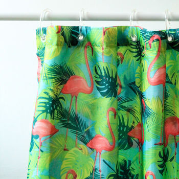
Adding a touch of fun can give your bathroom a little facelift that then puts a smile on your face. Not On The High Street has a wide selection of fun home accessories, including many for the bathroom. A new shower curtain or soap dispenser is sometimes all you need…

Not On The High Street, Flamingo Shower Curtain

Not On The High Street, Square Hand Painted Soap Dispenser

Bathrooms, don’t just have to be practical, they can be exceedingly beautiful too, and offer a playground for trying out your ideas and passions. So, go wild – and you may come to love your bathroom so much it becomes your top hangout spot in the house!

Read Full Post »

Whilst we are just still in the season of rounding up 2014, can I add one last offering of my own which is some great paint colours we have used, discovered and reacquainted ourselves with during the last year. Here are 10 of my favourites.

1. Fired Earth, Elizabeth’s Parrot

This is a fantastic shade of green which reminds of the colour of fresh green basil. However, the inspiration for the shade is far more glamorous as it is inspired by the beautiful Helmut Newton photograph of Elizabeth Taylor in her swimming pool with, you guessed it, her parrot.

Helmut Newton Elizabeth Taylor

www.firedearth.com


2. Abigail Ahern Bleeker

Dark colours in interiors are oh so in at the moment which is giving us lots of lovely shades to choose from. No one does dark colours better than Abigail Ahern and of her very tempting range I have chosen Bleeker because it is sophisticated and elegant but also warm and inviting. Be brave and use it liberally.

abigail-ahern-paint-bleeker-26218-p[ekm]334x501[ekm]

Direct from Abigail Ahern www.abigailahern.com or from Rockett St George www.rockettstgeorge.co.uk


3. Gold

I’m serious. Lovely lovely gold, particularly on the ceiling. Getting the look right is almost entirely dependant on using the right product and I would highly recommend specialists Gold Leaf Supplies who know what they are talking about. This beautiful room, with its lovely gold ceiling by Leslie Hayes Interiors and is taken from Decoist.com with thanks

Gold leaf ceiling

http://www.decoist.com/2013-07-31/golden-accent-leafing-modern-interiors/

www.goldleafsupplies.co.uk/


4. Farrow and Ball Railings

I rediscovered this beautiful colour when looking for a black for a monochromatic scheme (so easy to get this look wrong). This black is deep inky blue and so is softer than pure black and if you use one of Farrow and Balls lighter neutral greens (such as Hardwick White or Old White) you get the lovely black and white monochrome effect with lots of class and softness.

Farrow and Ball Railings

www.farrowandball.com


5. Zoffany Fig Grey

An ever useful colour because it is so beautiful. It looks quite purple in the picture shown and indeed it does have those warm base notes but it is also a very modern grey so can be used in both contemporary and traditional settings.

Zoffany Fig Grey

www.zoffany.com


6  Marston and Langinger Peacock Blue

I treated myself to a tester of this paint when I was placing an order just because it looked so luscious and it was everything I hoped for. It has just a tinge of Teal in the blue and it is perfectly named because it absolutely could be found in the feather of a peacock. I haven’t used it in a project yet but I live in hope.

M&L Peacock Blue

www.marstonandlanginger.com


7  Farrow and Ball Setting Plaster

This is one of my all time favourite pinks and so there are few years when I don’t use it somewhere. This picture is from a grown up girl’s bathroom that we did a few years ago but I am shamelessly using it in my round up for 2014. What is so lovely about this colour is that it manages to be both feminine and classy at the same time, because I think, it has no hint of bubblegum about it at all

Picture 351   Picture 365

www.farrowandball.com

8 Marston and Langinger Bayswater

I refuse to put together a list of 10 paint colours without including a glorious yellow – greys may be the colour du jour but I would personally never turn my back on a joyful rich mustardy yellow (there’s no primrose about Bayswater, thank goodness) which can be coupled with an off white woodwork colour and gilt picture frames – heaven.

M&L Bayswater

www.marstonandlanginger.com


9  Sanderson Graphite

Go on then, I’ll give you just one contemporary, urban, fashionable deep grey because they are rather fabulous. Sanderson Graphite is for grown up grey lovers and it is super smart. Use it bravely and it won’t let you down.

Sanderson graphite

www.sanderson-uk.com


10 Paint Library Paper 3

Finally, the architectural colours from Paint Library proved another winner this year – my job would be so much harder without this range. An old favourite that is still wonderful and fresh is Paper 3 which has understated class and great versatility. Use Paper 2 if your room is gloomy or Paper 4 if you are flooded with light. Often I find Paper 1 on the woodwork works brilliantly with Paper 3 on the walls – you see how useful this range is?

Paint Library Paper 3

www.paintlibrary.co.uk

Wishing you all a wonderful colour filled 2015!


Read Full Post »

It’s easy to feel a bit nervous about using wallpaper with all the pattern, colour and occasional bit of texture that it brings, but I think that wallpaper is a wonderful decorating tool and following a few key principles will help to achieve just the look that you are after.

As with any scheme, it is important to find your own style and stick to it, and this very definitely applies to your wallpaper selection. From traditional to modern, and all the styles in between, there is a wallpaper for you, so keep looking until you find a design that works for you.

St Judes Spey Stripe

Angie Lewin’s wonderful wallpaper with a hand drawn feel in beautiful knocked back colour tones www.stjudes.co.uk

Osborne and Little Tessella

By contrast, if you like a wallpaper to make more of a statement, Osborne and Little’s Tessella could be for you. www.osborneandlittle.com

If you are using a wallpaper, don’t be afraid to hang your pictures – the pattern will still provide a good backdrop to your artwork. This classic country trellis pattern wallpaper creates a lovely background to the pictures – and the impromptu cocktail bar!

Fired Earth Walled Garden Broughton

Fired Earth Walled Garden Broughton  www.firedearth.com

Look at the paint colours for your ceiling and woodwork carefully as generally you want them to blend with the colour tones in the wallpaper. If your ceilings are low or sloping, think about wallpapering them – be brave, it will look great!

Kate Forman

The low sloping ceiling of this room is disguised by wallpapering it in with the walls. Beautiful Blue Roses wallpaper by Kate Forman www.kateforman.co.uk 


I generally think that if your wallpaper is patterned (rather than a textured plain paper) that a plain curtain works better. However, there is the odd occasion that using a matching curtain and wallpaper can look stunning.

Lewis and Wood Venetian Damask

This very classic damask pattern wallpaper from Lewis and Wood looks wonderful with matching curtains. Lewis and Wood Venetian Damask http://www.lewisandwood.co.uk

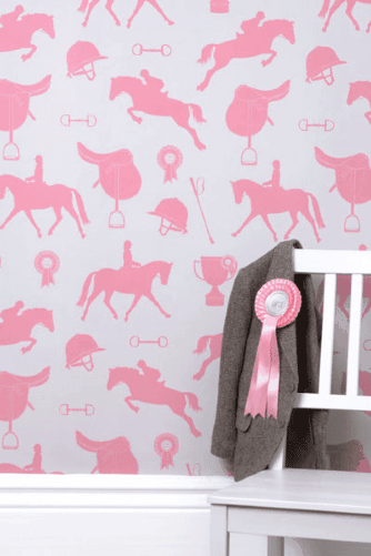
Wallpaper is a great way to add personality and fun to your children’s rooms and there are some great new patterns on the market for you (and your little princes and princesses) to choose from.

Rockett St George Gymkhana

Gymkhana wallpaper from Rockett St George www.rocketstgeorge.co.uk

Pierre Frey Les Bidules

Les Bidules wallpaper from Pierre Frey www.pierrefrey.com

Happy decorating!

Read Full Post »

We were rather thrilled when a very beautiful press release arrived from Fired Earth announcing their new collection of ten paint colours and two wallpapers in four colours inspired by the British country house. In the name of research, I went straight round to the lovely Cambridge showroom and got my hands on some samples and they are indeed gorgeous. The press release says that the paints and wallpapers are reminiscent of ‘classic country interiors, lazy bygone days and summer cocktail parties’, which is a quite a promise but I have to say, they do give more than a nod to these sentiments, especially when shown off in the charming settings shown in their images. If your style errs towards the traditional British, I think you are may be in for a bit of Easter weekend decorating. I am already wondering where to put a bit of Margaret Rose paint here at Chateau Burren.

WALLEDROUSRS2

DipintheLake_Paint_003P Gin_and_Tonic_002_1P SECRETHELIRS3 SECRETRIVIRS1 WALLEDBROURS4

Read Full Post »

Earlier this year London Underground celebrated its 150th anniversary. To mark the occasion, TFL (Transport for London) have collaborated with a number of designers to come up with some iconic underground themed collections.

Fired Earth has recently released their beautiful new limited edition ‘Underground 150 Collection’. On request of TFL, Fired Earth were asked to delve into the London Transport Museum archive’s and recreate a selection of some of the finest tiles used in London Underground stations. Using the original moulds taken from the archives, Fired Earth has done a spectacular job and has revived some truly delightful designs.

0938cac8cefd24b44b08bb515f9db954

c3c879a48d43567c8ed1b7a62798c42b

The ‘Edwardian’ range, originally designed by Leslie Green in 1903, features the recognisable pomegranate and acanthus leaf designs with base tiles and dados in matching shades.

6e09cc845c383a5e60137cbf67f34b4c

28c66150a1ec180d710691699a17a37b

Perhaps the most iconic range, ‘Signage’, includes a selection of famous underground phrases in their original typeface.

ea9aed8409c71533c39a28196ae5dffe

67740ff4b2b0fd2f585f71d55df2b64f

The ‘Landmarks’ range features the designs of Harold Stabler, who was commissioned in 1939 to create large scale architectural ceramics for a number of Underground stations. Fired Earth has reproduced their favourite, including St Paul’s Cathedral, Crystal Palace and the Palace of Westminster.

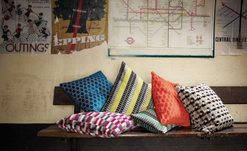
In their ‘Underground Collection’, Kirkby Design has also collaborated with TFL to recreate these London Underground seat fabrics, which I have never seen looking so good! Taken from the London Transport Museum archives, these old moquette fabrics have been transformed into a fantastic contemporary collection of viscose velvets, which are cool, retro and rather iconic.

underground-05

Bench: Marylebone Kingfisher. Cushions from left: Marylebone Neon Orange, Piccadilly Havana, Bakerloo Neon Orange, Bakerloo Magnet.

underground-01

Cushions from left: District Blackberry, Bakerloo Kingfisher, Marylebone lime, Marylebone Eden, Bakerloo Neon Orange, Piccadilly Havana.

underground-02

Sofa: District Gold. Cushions: Bakerloo Magnet, Bakerloo Jet Black.

underground-08

Seats from left: Piccadilly Neon Orange, Piccadilly Kingfisher.

These collections have given me a fresh look at the London Underground, and the distinct designs that have transpired from underground transport. Do take a further look as there is plenty more to see, including Fired Earth’s fantastic vintage underground poster range.

This blog first appeared on the Cambridge Evening News website.

Read Full Post »

Older Posts »